My Blog
7/30/25 - 2:23 pm | Summer Re-appearance
Nobody knows when the next Sparrowfish update is going to happen. Least of all me! It’s once again June, leaving me with a whopping total of three blog entries in the past year… oof. At least they’ve been long ones!
Since I’ve last written, I’ve learned the magic of HTML entities, but can’t yet be bothered to use them in a longer text post. Maybe someday my apostrophes and parentheses will be in the correct font, but today is not that day.
This past weekend, I went to visit my friends at their summer apartment in Boston. I got to visit a few historical sites, and even see the spot where the Boston Massacre took place. There’s a Sweetgreen there now. I also had an amazing time visiting an art market, which thoroughly dented my bank account, and left me feeling inspired to bring my art into the tangible world, rather than existing as digital files forever.
A little less recently, but a lot more life-changingly, I was accepted into Oberlin’s brand new, dual-degree BFA program. In this program I will finish my four years of my BA, before relocating to the Park Arts space in Cleveland Heights. So many of my extremely talented, super-cool classmates are also going to be a part of the program, and I am eager as hell to get back on campus and sink my teeth into our integrated arts workshop this coming semester.
I made a brief foray into youtube and video editing, creating a small compilation video from clips of Bob’s Burgers. You can watch it here. I had a fun time messing around with CapCut, and may do more with it in the unforeseen future.
In regards to Sparrowfish itself, I’m excited to say that the website feels very settled in my mind. Most of the time, after returning from a long absence like this, I find myself wanting to completely uproot the entire site, and re-write it from scratch. This time, I’m coming back to a tool that feels complete, and well-fitted to displaying my miscellaneous creative projects. So, hooray for that, and hooray for summer fun!
2/26/25 - 1:10 pm | Ober-whelmed
I just re-played the game Florence. It made me think about what the app store could have been if it hadn't been turned into a relentless churning machine of ad-filled slop. There is something to be said for coding as an art form, be it via video games or interactive websites. I think of the bored button and the plethora of websites it links to. None of them exist to sell something or even to be very useful, they're just meant to be experiences. I think that's really cool. Another game I think of is bird alone. It's similar in its limited gameplay, it's telling a story: the player is just along for the ride. All excellent examples of digital experiences, I highly recommend checking them out.
Personally, I am emerging from schoolwork hell. I got behind on my work while I was focusing on family stuff, and I've finally felt like I have my head above water again. Now I just need to wean myself off of the copious amounts of caffeine which helped me get the job done! The weather in Oberlin is grey and gloomy, but warming slowly, at least. Yesterday, the sky was blue and the temperature got up to 50 degrees! It was such a relief to sit in the sun, knowing that I had accomplished a lot of important things.
The “Written Works” Section is under construction because I need to re-format all the stories for the site update. I may also remove a few of the stories, and replace them with more recent work of mine. I don't have a set timeline for when that will get done, but stay tuned.
In miscellaneous news, my favorite dining hall got new fries and I miss the old ones dearly. They were crinkle-cut and crispy. These new ones are soggy and have marks on them that make it look like they were cut on a table saw. I am hoping this is temporary and not a budgetary thing, but then again this really is the least of my problems.
2/6/25 - 5:10 pm | New Semester
Note: this blog was accidentally deleted, and then re-added. Time stamps may not be accurate.
Phew! It has been one hell of a week. Starting my fourth semester at Oberlin, trying to recruit for ScoobyCo, and I still need to find time to apply for internships somewhere in there. A friend of mine pointed out that the last blog post I created was in June. Whoops! Time really has flown. In fact, I can't believe it, but I've had Sparrowfish for a little more than a whole year! It still feels like I barely know what I'm doing most of the time.
Sparrowfish has become a nice hobby as art has transitioned into being the thing I do for work. That change is a bittersweet one, but I think ultimately for the best. I'd rather love my work than hate it, and I get to cultivate a new skill in the process. And, as the internet becomes increasingly monopolized, I think it's important to remember what it can be. HTML is ultimately not too difficult to write, and creating a personal site is the only way to be sure that your life isn't becoming algorithm fodder. I sometimes think it would be really amazing to have a webring of friends, all of us with our own websites.
There was a time not too long ago, where the internet was a place that one had to physically go to, be it a computer lab or just a family PC. Computers were information terminals, not evil little attention-sucking rectangles. If I had self control, I'd like to live my life like that. Then again, I'm typing this on my laptop connected to WIFI, and that's an excellent convenience.
This has been a big stream of consciousness typing-fest, but huzzah nonetheless because I have written a blog entry!
6/14/24 - 3:13 pm | I finally did it!!
Today, I made a change to Sparrowfish that will be almost entirely invisable to users, but it will make a world of difference to me. Using Javascript, I created a central page where I can edit the navigation bar on top of this site. Until today, that feature had to be hand edited on each indevidal page where it appeared, every time I wanted to add a page to the site. As I'm sure you could imagine, this really hidered me making any really big changes to Sparrowfish, because of the tedious copy/past hellscape it would land me in for the subsequent few hours.
This opens up a ton of new options in terms of pages that I might want to add for a few months at a time before replacing them, or even just an ability to expirament a bit more. So, Huzzah for quality of life updates!
6/6/24 - 3:50 pm | Coming Soon!
Recently, I have been toying with the idea of reviving the "live project" page which briefly existed on Sparrow 2.0. But, I want to be more concrete about what it's for. I really love writing serialized fiction, and I have been working with a story for a while now that seems to be up for the task. I have a strong idea of where the story will end up, but it's tricky to maintain motivation to get to that point. I think throwing it to the void of the internet will at least make me feel as though someone somewhere might be reading it, even if that's not really true.
I don't have much of a timeline for when to expect this to be up, but I currently have a display page of Sparrowfish all made and ready to go for as soon as the first chapter's ready. It's a bit of a departure from Sparrowfish's typical vibe, but I think that makes it easier on the eyes in terms of reading for long periods of time.
In general, I'm also very excited about these characters. And I'm excited for them to make a debut.
More updates soon!
5/31/24 - 9:09 pm | Well, as long as I have VSCode open...
Hello hello! Today, I have uploaded "In the Mountains," a short story which was also the final project for my creative writing class this past semester. The concept is abitious, and I'm not totally sure that I pulled it off. So, it's possible that it may be updated as it is further revised. But, as of now, it's in at least somewhat of a stable state. Stable enough to publish, anyway."
The farther removed I get from the buisness writing class that spawned this iteration of sparrowfish, the more inclined I am to reclaim this site as my own little weird wonderland. As such, I've been thinking about writing up some fan pages or maybe just some fun, more off-the-cuff stuff. I can feel myself starting to get bored of this format, but the site is so big at this point that any massive overhaul wouldn't be worth it unless I learned enough Javascript to also overhaul the functionality of the site from the back end. There are lots of little quality of life things I'd like to implement for myself, but I'm just a little too inexperienced to do that right this moment.
I can feel my boredom with the site manefesting especially in the home page. Luckily, It's a scrolling, easy-to-add to format. So hey! Keep an eye out for some changes to come.
5/24/24 - 5:41 pm | Home at last!
Hello hello! Welcome back (me) to Sparrowfish! It's been a bit since I've last written. I'd apologize, but I'm not too sure anyone checks this blog. Anyways, here's some updates for whoever's reading. I have a few short stories which are a product of last semester's creative writing class. Those will be up shortly. Also, I have been drawing a bunch, but mostly commissioned work, so nothing to be posted here. It's great to be back home, with my family. Secondarily, it's great to be back where the free food actually tastes good!
I've spent the past few days binge watching Dr. Who, which is nostalgic for me. I watched the first four seasons over a period of about two years with a friend of mine. As a refult it's wormed it's way into my life and feels much more meaningful to me than any other show that I could watch in just an afternoon. I never got past the tenth Doctor (at that point it was time to leave for college) so, I'm looking forward to seeing what's to come for the series. It looks like the new, upcoming Doctor will be a bit of a return to form for the show, so I am really looking forward to it.
Also, the deadline for the Corn Syrup Zine-- a seperate project of mine from Sparrowfish-- is fast approaching. So, I'd better get to hammering down the finer details of that.
Lastly, I think, I am embarking on my long-desired quest to become a tattooer. I'm getting to the age where I really need to seriously consider my career, and I've been sure for about three years now that I want to tattoo. So, now's the time to make that dream a reality. All this to say, I may be replacing the shop with a tattoo diary of sorts; as a way of logging my progress on my way to this goal. Speaking of updates I'll also be changing my bio soon. It was written for a class, but in all honesty I hate it. But, now that I've got my grades in, it can be changed. Anyway, that's all for now. Bye!
4/25/24 - 6:49 pm | well....
Dude, I' not sure if I like it or not. Hmmmm
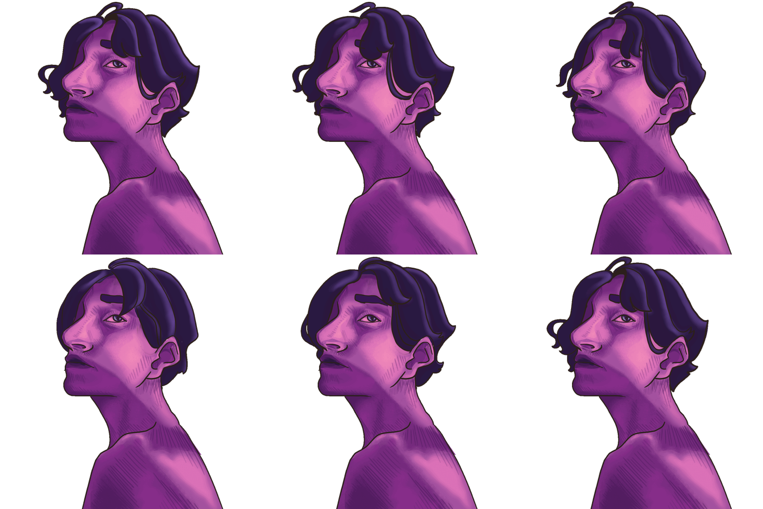
For reference these are the edits... I have to think on this some more
4/25/24 - 6:45 pm | ACTUALLY
With a few quick edits, I quite like how the gif looks. I'm still not entirely sold but I think I'll leave it up for now.
4/25/24 - 6:09 pm | miffed by gifs
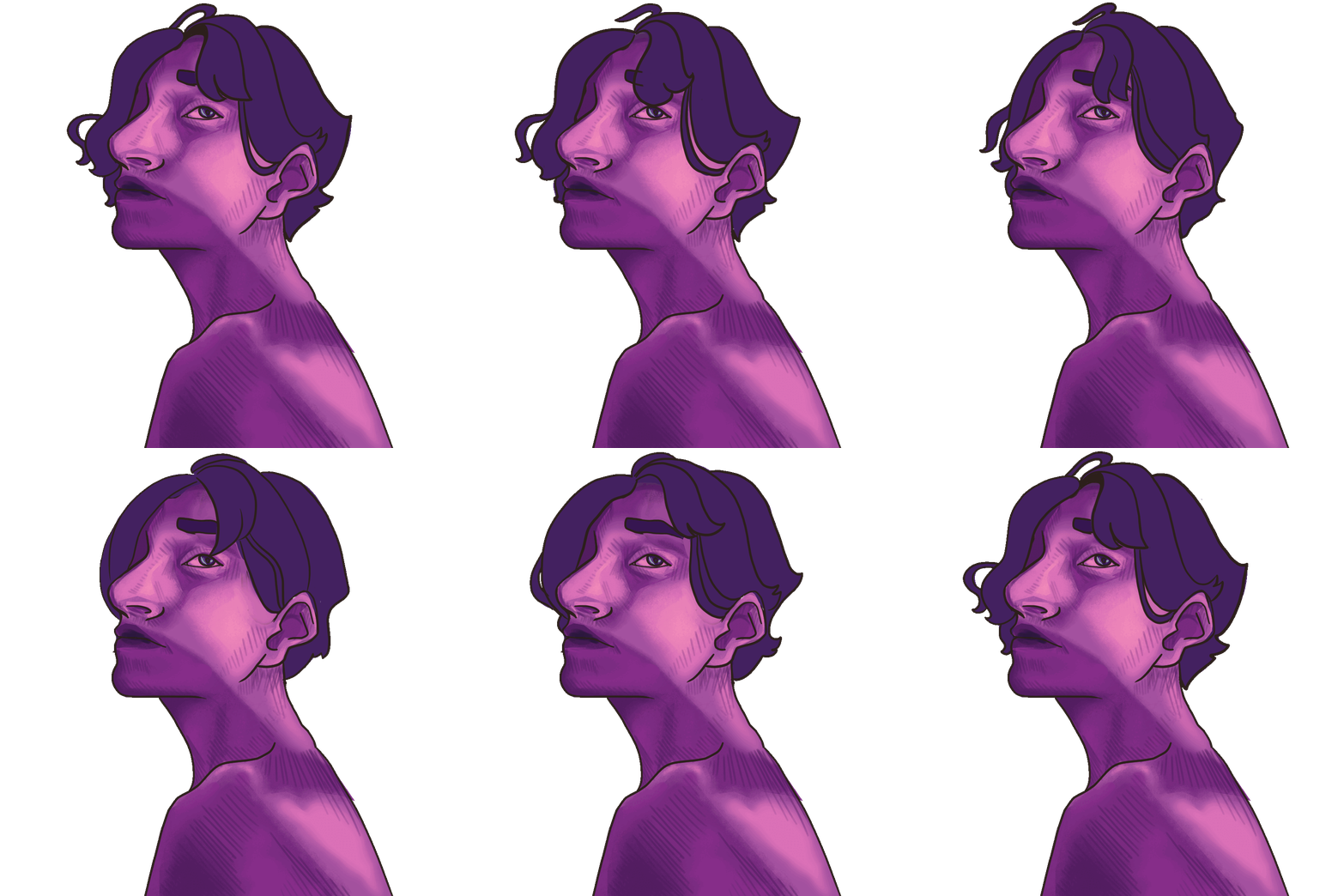
Today, I spent most of my time working on a gif. It's a modified version of the self portrait on the home page. I really like how that portrait is positioned on the page, and I think it makes for a striking enterence. However, I am beginning to grow restless with the content of this site. However, I am wary of another total re-built, especially so soon. So, I thought I could create an animated version of that picture, to spice things up.
I love how gifs look on other peoples sites, and I am begging to get a bit self conscious that my site is too darn static, so it seemed like a good plan. So, I spent hours fiddling with Krita and Gimp, editing and animating, until finally I emerged with a functional gif in hand. I went to place it on the home page and... I didn't like it. Nothing wrong with it really, it just looked a bit bizzare. It was the only animated element and the hair was no longer shaded in, only flat colored. Also, the movement is really exaggerated, almost hard to look away from, which is not what I want at all.
So, lesson learned, I'm chalking this one up to a study of animation and moving on. But, it seems a shame to do all that work and not post it anywhere, so, enjoy!
4/23/24 - 9:29 pm | New Comic!
Today, I posted a new comic to the library. This exciting for a few reasons. First of all, since the effort of uploading old work is largely taken care of, this site can finally settle into it's role in my life as a hub for my creative works. I think this new comic, which is titled "Saturday" fits in especially well with this goal. It is only four pages long, and text-dense, so it can't be printed as a mini-zine, but, I don't feel a strong need to expand on it or refine it. So, it lives on Sparrowfish.
Despite it being a bit of a one-night vent than it is representative of my abilities, I am proud of it. I surprised myself with how much I liked the look of the characters, especially on the first and last pages. Often, I worry that the way I stylize people looks messy and unrefined. Although, I suppose looking at one's own art is like staring at their own handwriting; you see it as somehow defult (and therefore unremarkable) and simultanously too outlandish to be acceptable. It's a weird phenomena.
In more personal news, The Narcissist Cookbook is touring in the US with Bug Hunter, and I am beyond excited. My mom and I are planning to go together this summer. I've never had the experience of attending a concert of somebody I was a fan of. Usually, I get invited along to a show featuring somebody I'm not super familiar with. So, I wonder how different it will be coming in with prior knowledge of the performer
Also in music news, my new favorite band, Time Bug is in the process of recording their songs for release and oh DUDE am I ever so excited. As much as I love TNC's FUNGUS, it's going to have to cede the limelight as soon as Time Bug releases their stuff.
That's all for now! Stream Time Bug, get tickets for The Narcissist Cookbook & Bug Hunter, but most importantly (on this site, at least) check out my new comic, "Saturdays," now available in the library!
4/10/24 - 8:31 am | Oh, Oberlin!
Good morning! A few days ago, I had the absolutely awesome experience of seeing a total solar eclipse! Let me tell you, the movies don't exaggerate. It was every bit as spectacular as I hoped. It's also been very interesting to see families and non-Oberlin people on campus for the eclipse. I think students here have a tendancy to forget that the school is part of a larger community. I heard a lot of my peers making comments about how strange it was to see families on campus, which bummed me out if I'm honest.
Oberlin, OH-- as in the town, not the college-- has a population of more than 7,000 people. It strikes me as really strange to act as if the school must be at the center of the universe for everyone who lives here. Although, I do kind of understand why students fall into that thought. Hell, the school's major marketing event is called "All Roads Lead to Oberlin."
In other news, I've recently been toying with the idea of a multimedia fiction project, which would span multiple websites to tell an immersive story. Kind of like an ARG, although I don't have the resources for scanvenger hunts or in-person puzzles. What little concept work I've done for this project feels really promising. I have no timeline on when this would see the light of day, so it might wind up languishing in my drafts for a while like "Lost Things" but nonetheless, It would be really cool to see it come to fruition.
3/25/24 - 11:48 am | Turned In!
Good morning everyone and welcome to Sparrowfish 3.0! As of this morning this site is in a somewhat "done" state. (although, is a website ever truly done?) What I mean by this is that it's been turned in! So, Sparrowfish's obligation as a deliverable for one of my classes ends today! Huzzah! I also gave in and purchased a Neocitied supporter account. This was for a few reasons. First of all, I designed this site with many many files which-- upon trying to upload them-- I discovered were not allowed by a free account. And, I had grown quite fond of the site's design, and really didn't want to change it. Also, as Sparrowfish settles into becoming a banner for my personal brand, it doesn't seem like the best idea to be introducing large, owerwhelming changes on a regular basis. So, I wanted the ability to create multiple sites under one account.
3/16/24 - 11:31 | Good Morning
Good morning Sparrowfish readers. Since last posting on this blog, I had the absolutely mortifying experience of my professor quoting my blog to me in the midle of class. I honestly can't be too surprised. This site has become an example site for the class as we are all having to build websites. I really appreciate his willingness to let me talk about web design and my experiences creating Sparrowfish. I guess I just wasn't expecting him to actually peruse my stuff. As jarring as it was in the moment, I really appreciate that he went out of his way like that. It was actually pretty cool of him to do.
Today, my friend/honorary roomate and I are locking in at the library. It's midterm season and oh MAN do we ever have a lot of work to do. She seems a little bit more overloaded than I am. Although frankly there is a high likelyhood that I'm just not panicking as much as I should be. For all the work that needs doing, there's a not-so-small part of me that wants nothing more than to boot up VS Code Editor and whip up a Sparrow 3.0. This is a patently horrible idea for a few reasons. First, I just finished a ton of new formatting updates and it would be a pain in the ass to replicate them. Also, there is so much that actually needs doing, I cannot possibly justify spending my time on coding. Still, the idea's nagging at me. I think a few changes are in order. The visual language of Sparrowfish as it currently exists is growing stale, and I'm not sure how much longer I want to be straining against the design. Also, much like last time the site got a facelift, my coding skills are starting to evolve beyond what they were when I layed the foundation of this website. So, I am starting to get annoyed by a lot of redundancy, inflexability, and shoddy workarounds.
The more I type about this, the more I am beginning to feel inclined to actually attempt it... which I know I'll surely regret in about two hours. Ok, this is totally rationalization, but if I work on school stuff until 1:00, that totally justifies spendind the next twelve hours on code, right? Right.
3/7/24 - 11:44 am | A bit redundant, aren't they?
As I've been uploading my works for my gallery, I've noticed a trend: thin, white, afab/femme presenting subjects. More specifically, one thin, white afab subject: me. As an artist, I don't often start by sketching or planning my works. Drawing is an emotional outlet for me, so a lot of the process has become automatic, with me falling back on old habits time and time again. Many of the works in my gallery, as well as my works in general could be categorized as self portraits. The only face I have to reference in any pose imaginable, at any time of day, is my own. With so much practice drawing my specific face, it becomes the default if I don't put any thought into it. I use myself as a stand-in for any generic person just because, for me, that's easiest to draw.
In many respects I think this is fine-- maybe a little concieted-- but fine. However, it doesn't reflect my own values. I belive diversity is important, and even more so, I belive it is important for artists to practice drawing diverse subjects. I'm not sure what to do about this as I am in the process of uploading archival works. The truth is I haven't drawn many POC, fat folks, disabled folks, etc. However, once the archival process it done, I do want to commit myself to creating art which better represents the world I inhabit.
3/3/24 - 00:00 | Heartbreaking News
I am applying for summer inernships, and in an attempt to look "more professional" and "less like a immature kid" I am removing the fish page. Farewell, my friend, you barely had a chance to be here :(
Recently I've been struggling with the idea of a career in general. The prospect of making myself marketable to employers hurts my heart. I know that this is how the world works-- that my two options are get a job or starve-- but it's just kind of a bummer to sand away the edges of my personality to do that. I like the fish button, It makes me smile. I like having works on this website that wholly and truly represent me. I hate the feeling of cramming all the messy bits inside, and holding them in with a buttoned shirt collar.
Is this blog unprofessional? Are cool pixel fonts unprofessional? I have no clue. Not a single clue. I have always been the weird kid... dude that's been the one consistant in my whole life. I have a hard time relating to my peers most of the time, even as a young adult. I always hoped that if I didn't try to hide the bizzare bits of me, it would repel the people who were going to be judgmental, and attract the other weirdos. Now the judmental ones are who I need to impress, and I have no clue how to do that. I don't really want to do it either, but survival is survival.
I guess what's brought this on is a class I'm taking. It's a buisness writing class. We're learning how to develop our professional identities, by creating resumes, cover letters, and websites. I already have a website. It doesn't make money, it's not optimal for marketability, it isn't shiny. I made if for the joy of creating. I made it to fill a void. Now, I'm halfway through coding a new website for the class assignment and I am saddened by it. Sure it looks nicer, but I feel every action being passed through a sieve of corperate acceptability.
Right now, I feel like any facet of my personality which can't make a share price rise, needs to be discarded. I hate the feeling. Farewell to the fish page, man, I'll really miss you.
2/20/24 - 12:32 pm | Important News
I made the fish button finally work. It's perhaps the thing I am most proud of on this website. In other news, I am still very sick, which may explain why I've done this.
2/20/24 - 12:10 pm | Hello from my bed :/
Oh, dude am I ever so ill! I put an old written work up on here today, partially so I had something a bit mindless to do while I languish in bed. Not sure if it's Covid, or just a particularly persistant cold. Either way, I don't plan on leaving my room much today. My lovely girlfriend (she reads these, hello darling!) Offered to bring me some food and a Covid test. Two things that I am greatly looking forward to. Who knows, today might be a good day for Sparrowfish fans, because uploading archival content is easy enough, and makes me feel as if I've actually done something with my day.
That's all for now. Godspeed!
2/12/24 - 2:48 pm | Little Touches
Still on my library adventure, but in the hour (ish) since my last update, I've added a favicon to this site! (that's the little logo thingy next to the site name on the tabs) Its a sparrow and a fish, because honestly what else would it have been? I also added a little mini time machine! Well, that's overselling it a bit. I've mentioned in previous posts that I wanted to add a way for people to view what Sparrowfish looked like when I was just getting started. I wanted to do this for a few resons. First, I just think it's cool, but second I wanted to leave it as a landmark for people who may just be starting out on Neocities. I was really intimidated getting started, and it was super frustrating trying to figure out how to get HTML to do what I was invisioning in my head. So, I thought it might be cool for visitors to see what a beginer site looks like. Mind you, I was super proud of it at the time. It in itself was a revamp of an even earler iteration which is now broken beyond repair. It was just a lot of grey-green boxes and blue links anyways. Nobody's missing out on much!
It felt garrish and maybe a little self-absorbed to have the button so visible, so I put it at the very bottom of the completed works directory on the index page. I thnk anybody willing to scroll down that far probably wouldn't mind it. It's also a nice way to acknowlage that this site is itself, an ever-evolving project of mine.
2/12/24 - 1:10 pm | Adventures from the Public Library
With the first week of the semester in the books, I'm excited to be back in Ohio, as bizzare of a state as it often is. There's a new live project up, a Choose Your Own Adventure game which I'm excited to see come to fruition. A lot has happened since my return back to college. I went to my first house show, got a tattoo at said house show, aquired a library card, and I've managed to stay on top of my homework reasonably well.
Today, (right now) I am on a study date at the local public library. You may be asking, shouldn't you be studying instead of writing a blog post? You would be right! I should be, but alas. I am enamoured with this lovely website, checking back in with it drives me to improve the appearence of this site. Just look at all those gifs! So cool!! So, now I'm sucked back into the world of NeoCities as if I never left in the first place.
Currently, there is an awkward empty space on the homepage, underneath the finished work directories. I'm not sure what to put there. One thought I had was to move the featured content section there. As of right now it's a sidebar on all pages of the site. I don't have an intutive way of editing them all at once, so I do them indevidually, which is a pain and makes them difficult to change quickly. This is not an ideal situation for the "featured content" section of a website. Although, now that I mention it, it is in especially dire need of an update, so I may have to bite the bullet and do the damn thing!
1/31/24 - 12:55 pm | Sparrowception
Today, I did something super exciting! I formatted and uploaded Sparrowfish. If you're new here (aka don't know me personally) you're probably wondering what I mean. Well, before Sparrowfish was ever a website, it was a comic. In fact, it was my first-ever comic. I completed it as a challenge to myself. I wanted to see if I had the willpower to complete a long term goal, which is something I really struggled with. Lo and behold, I did it! As a result, my outlook on creative projects and art shifted for the better. I even got a tattoo of a beta fish to comemerate it!
The story of the comic follows Vallie, a Vailtail beta fish which lives in a stream. She falls in love with a human girl, and uses magic so they can be together. Its definiately in the same realm as Ponyo, The Little Mermaid, or Luca but I enjoyed putting my own spin the fable. Looking back on it now, two years out, I am curious what the outcome would be if I tried to re-draw it, as kind of a remastered edition. I'm not making any promises, but the idea is certainly floating around in my head.
Because of Sparrowfish, I've had the confidence to create The Lavender Glyphs (potentially coming soon) and most recently, "Lost Things." I knew at the time that it would give me a boost on confidence, but I had no idea how transformative it would be. So, cheers to Sparrowfish, and the past version of me who set out to create it. I owe them both a lot.
1/30/2024 - 1:53 pm | Quality of Life Updates
Notice anything different about this page? Hell yeah you do! I figured out how to add a custom scroll bar to sections of the site with a lot of content. This is especially helpful for the blog, but once the library starts to fill up, the written works and comics sections will be getting scrollbars of their very own. Also, you may notice a font switcher in the lower right hand corner. That does exactly what it says on the tin. Accessability is a big concern with customized websites like these. Limitless design choices means its easy for sites to feel cluttered, and difficult to read. Even I sometimes struggle with the pixel font. So, now we have the option to easily toggle back and forth between two typefaces.
Some quick Googling tells me that Courier is a Dyslexia-freindly font. It also matches the look of Sparrowfish pretty well. So, that's why I used it. Admittedly, I wonder if this was the best choice, so if theres a different font that may work better, feel free to let me know.
1/25/24 - 11:48 pm | Guess whats done!!
Thats right folks, weighing in at an increible 6,600 words, the Charcoal WIP is offically finished. You may ask yourselves, then why is the final entry not up on the live project page? This has a very simple solution, I can assure you!
I'm tired
The reason is that I'm tired
But the important part is that I got it done, and boy howdy did I ever. My mom read it before she wne to bed, and said she really enjoyed so I'm officalliy a cool kid who writes cool stories. B-) . In all seriousness, it should be up on the live projects page for as long as it takes for me to revise and format it. Then, once it's ready it'll go up as a written work in the library.
That's all for now! Huzzah
1/24/24 - 2:14 pm | Entry Two Posted
Holy paragraph divisions Batman! Entry two of "Charcoal" is now available on the Live Project tab I'm really happy with the pace I kept today, and I'm glad I was able to refocus my efforts on a story which is appropriate for the scale of the project, and is something I really feel conneted to. While I'm not obligated (by my own, self-imposed rules) to write anymore today, I'm on a bit of a roll, so who knows! I do find that having somewhere public to post these things is really helpful, even if it's often not read by too many people.
Also, the silly playlist I mentioned before is so cute! 10/10, impossible not to schmoove and groove along.
1/24/24 - 8:57 am | Good Morning!!
As my highschool theater stage manager would say, hello you lovely people! Today is a day of redemtion, a day of progress, and a day of really really *really* needing to get some shit done. A second entry of Charcoal will be up by the end of the day (EST) Until then though, check out the Live Projects page! It's pretty cool if I do say so myself.
If I know myself, and I like to think I do, I'll be working while seranaded by this funny little playlist. I hope you enjoy it as much as I do.
1/24/24 - 12:25 am | Live Project + Comment Section
Today, among many many things, I added a live project section to this website. As I've stuggled with completing my winter term project, I think having a place to post incremental updates to my work will be very beneficial to my writing. I am a bit nervous about the comments section, you never know with the internet, some people can be cruel. But! I'm hopeful that I can foster a nice community, and more importantly keep myself accountable to writing at the deadline fast approaches.
1/19/24 - 11:35 pm | Grilled Cheese Zine
Finally uploaded a second zine in the comics section of the library. Even cooler than that, it's my first ever zine! Made in the dark desolate year of 2021. I don't remember much of what was going on back then, but this was certainly a highlight.
1/19/24 - 10:12 pm | Book Display!
This afternoon I spent my time creating a method of displaying my comics that appears as a book that can be clicked through. Super exciting! I am worried that it's a bit unclear that you click on the pages to flip foreward and back, and I am half-expecting a bug report telling me that the comics display page is only loading the first page of a comic. Let's hope that doesn't happen!
I do really love the look of the book display image. I drew it pretty quickly as a placeholder, mostly just to make sure the dimentions are right. In its current state it reminds me of old Club Penguin art from before the Disney aquisition. Good times. In a perfect world it would be pixel art, but I do think some more traditionally styled art could help break up the visual language of this site, especially because the comics desplay pages are already a hub for works that don't necessarly adhere to the color palette of Sparrowfish.
I am proud of all the work I've done on this site in the past few days. I still have the old files from what it used to look like, and I'm considering creating a time machine page, where viewers can access the old version. Like I mentioned in an earlier post, that iteration of Sparrowfish was the true homemade site, where this version -- though still scrappy-- has trace amounts of skill in it as well.
here's to more skills as I learn!
1/19/2024 - 5:49 pm | Progress
As I round the corner to the end of the day, I haven't written enough. However, I've also worked really hard. Sometimes, I suppose thats how things are.
1/19/24 - 11:00 am | On The Winter Term Story
Today, like all days, I am focusing on my story for winter term. It's going very well but I feel as though I'm in a bit of a blindspot when it comes to its flaws. Because I've been staring at the same damn story structure/dialouge/characters for three weeks now, I have almost no idea how a reader with fresh eyes would view it. Because of this, I would really love a beta reader or two. Unfortunately it would have to be largely informal as I can't pay, but ideally any beta readers would also have their own work wich I could read/look over for them. So basically, I'm looking for a beta reader trade.
Because of this aforementioned blindspot, I am a bit more self-conscious with this work than my others. With my personal essay I know my word choice and punctuation are a weak spot so I am always on the lookout to improve them. I also expect feedback on that from my lovely readers (mostly my parents, hi mom and dad!) But, as it stands now with this project, I'll have to call it finished (per the requirements of the project) probably before I'm able to get any reader feedback on it, which is terrifying.
I do plan on continuing to revise the story after the winter term. More than anything I think this month will be an excellent springboard to a full-fledged story. If I really let myslef dream big I can see a world where I publish it as a short novel. It would be really cool to have a physical copy of my work like that.
So, onward I go, to work on this story. Interested in a beta reading trade? You can reach me with my new handy-dand super cool contact form. Wish me luck!
1/18/24 - 9:57 pm | Forms Forms Forms!
I have added another form to this site. This time, its a contact form. Feel free to reach out with any inquiries you may have. Google Forms isn't the prettiest solution, but with my extremely limited Javascript, and limited budget to pay for a third party form, I decided to keep it simple.
I do find it funny that my instinct when creating forms was to go out of my way to make it look as though it was home made. Because, realistically, any home-grown forms on the internest are done through Google nowadays. Ironically, I was putting more effort into making this site *look* handmade than just doing the thing that actually would have been easy for a beginner. It's the difference between buying jeans with patches on them, and patching up your jeans.
1/18/24 - 6:23 pm | Working Hard!
In the past few hours, I learned how to embed items into a website. (Behold, the bug report form!) I also had a very near miss with catastrophe (aka inconvienience) where I deleted my index file. Luckily, I was able to copy the HTML from inspect element before the page refreshed. In reality, that's pretty simple to do, but I was very proud of myself for figuring out how to do that.
1/18/24 - approx. 4:00 pm | THE FIRST BLOG
Today, I added a blog to this website, very exciting! I also worked hard on my story which I'm writing as a winter term project. The scale of the story has really ballooned since I first plotted it out. What was supposed to be a 7,000 word project is now looking like it'll need 30,000 words to get the job done. This is very stressful, but I have confidence that I can get it to a complete state by the deadline. Whether or not I'll be happy with the final results is a different matter entirely.
Stuff I Like
Bob's Burgers
A newly-discovered comfort show. I love getting to see weird characters who aren't made fun of by their own story.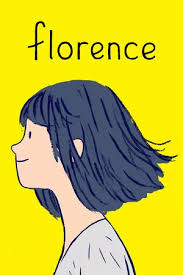
Florence
I played this game for the first time when I was eight years old. I didn't get it then, but damn I adore it now.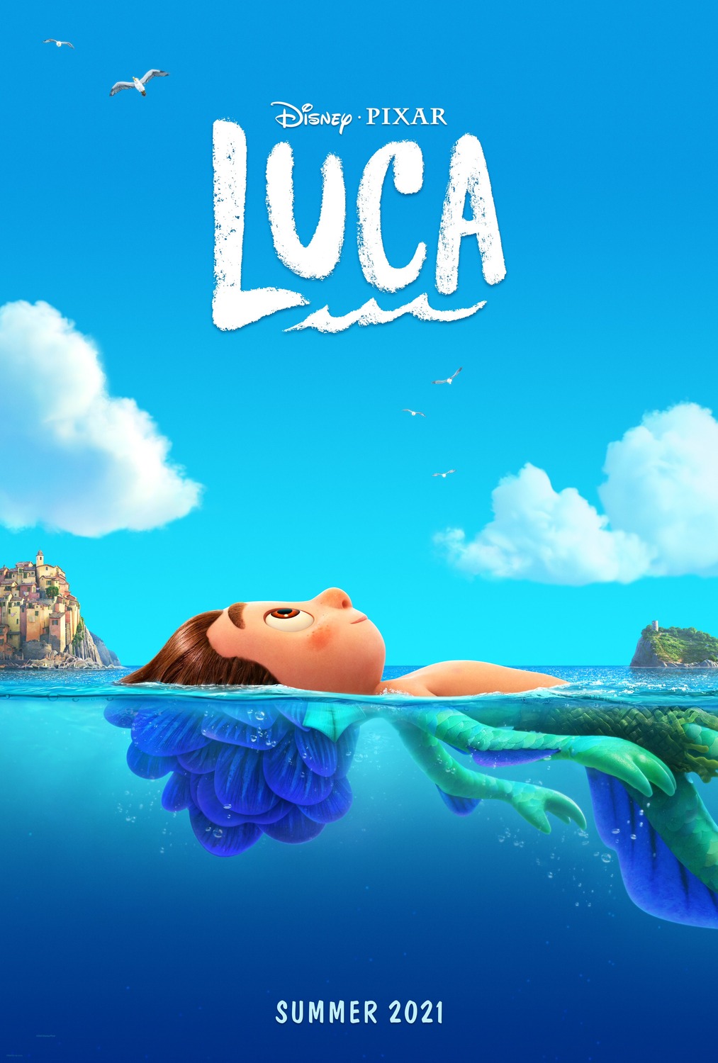
Luca
I absolutely love the innocence of the environment, the low stakes, and the kindness of the characters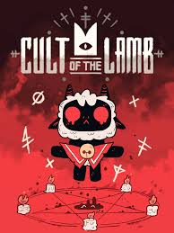
Cult of the Lamb
A resource management game with an occult twist. I always feel so bad when I sacrifice the little followers.
Doctor Who (2005)
I love media that can be engaged with on multiple levels! I love timey-wimey nonsense for the purpose of emotional storytelling!